monday.com · 2025
Churn to Earn: Designing monday.com's First Cancellation Growth Framework
Overview
I led design and strategy for monday.com's first cancellation flow, saving millions in ARR through a conversion funnel that became the company's framework for churn reduction.
Role
Senior Product Designer
Timeframe
Q1–Q2 2025
Team
1 Engineer
1 Data Analyst
Responsibilities
Research and discovery
Workshop facilitation
Strategic product definition
End-to-end design
Testing
Impact
$6.8M ARR
Recovered directly, through the new cancellation flow
13% loss reduction
From 3.9% to 3.38%, outperforming the 3.5% industry standard
$1.6M ARR
Recovered indirectly, after a second team adopted the framework for marketplace-app churn
+45%
At-risk members rescued, after a third team applied it to the member deactivation flow
Challenge
70% of monday.com's renewal losses ran through one poorly optimised self-serve cancellation flow, costing the company $84.6 million per year.
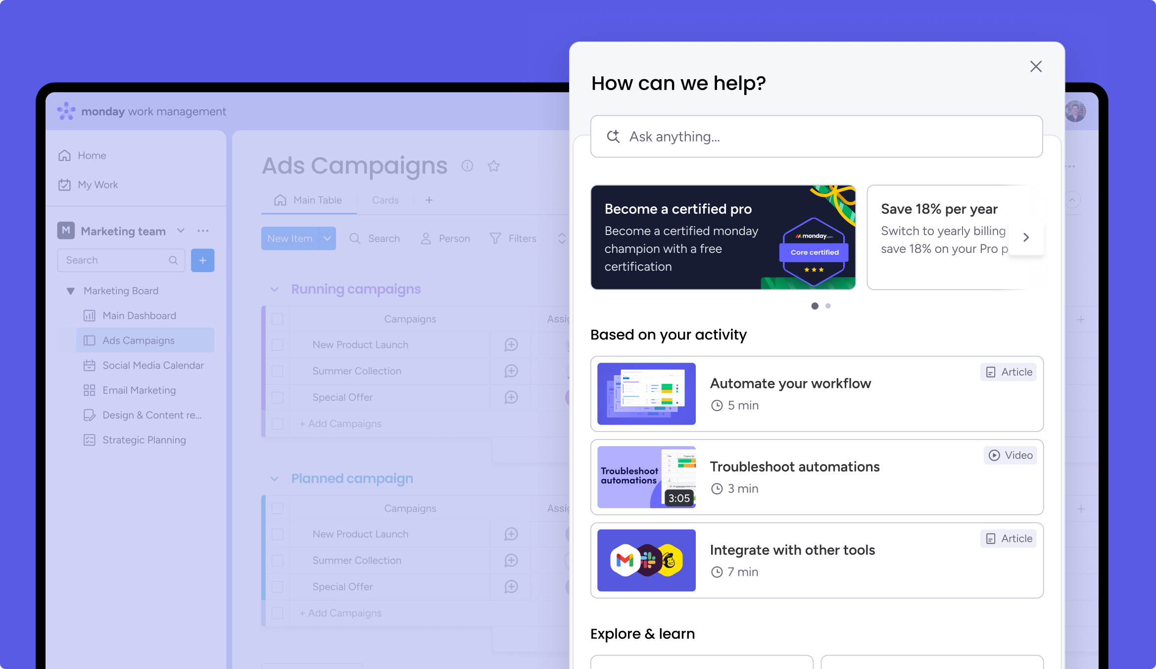
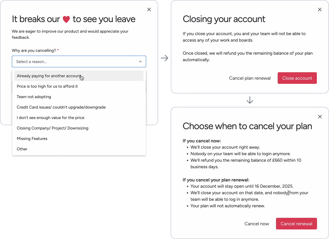
For years, cancelling a monday.com account meant clicking through the admin panel with almost nothing standing between an admin and a fully lost account.
monday.com had just crossed $1B in ARR, with $10B next in sight, and ARR loss was the single biggest thing working against that trajectory.
The goal reflected that ambition: get the current loss rate (3.9% of our self-serve renewal ARR) to 3.6%. We beat it in three months, so we raised the bar to 3.4%, and beat that too.
Approach
Building out a best in class cancellation flow
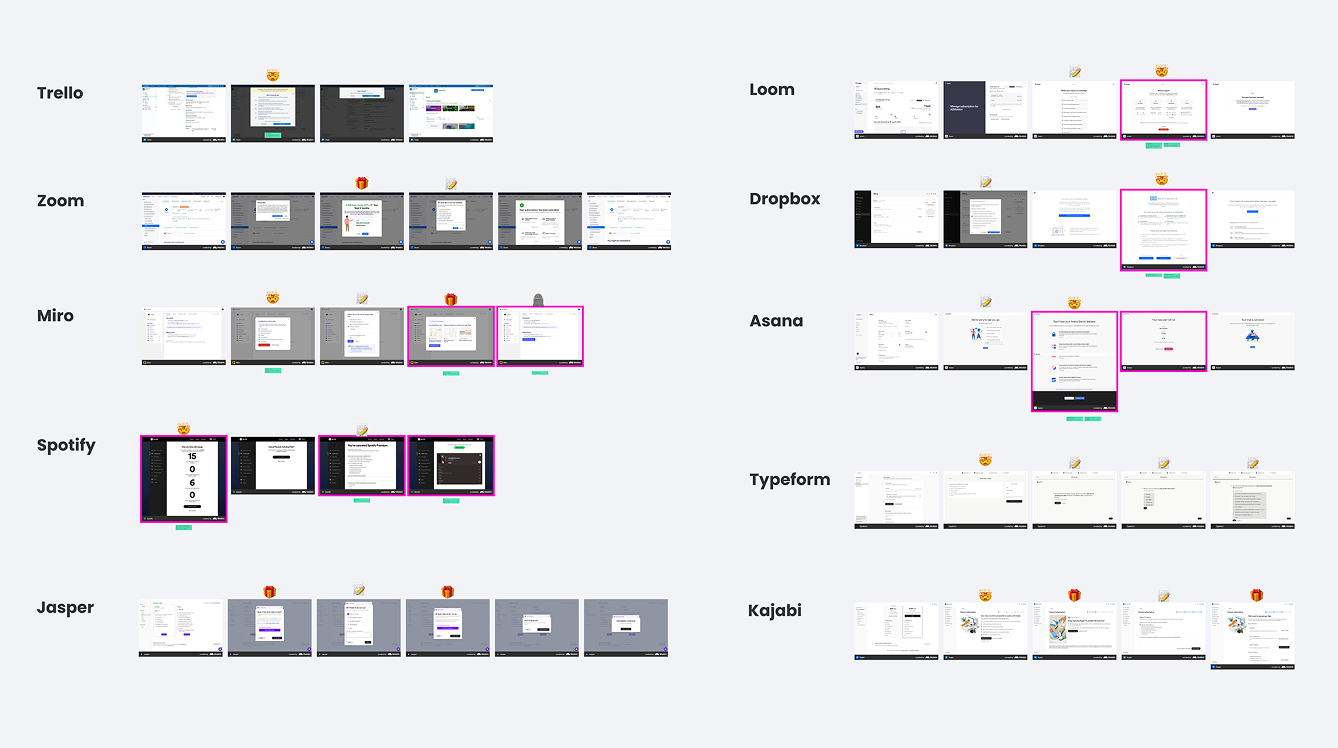
I'd never designed a cancellation flow before, so I started with deep research on best practices and an audit of us vs competitors.
Our five lever framework
Borrowed from best practice: exit survey, friction, loss aversion, salvage offer, resurrection, combining deep research from a variety of sources, notably Elena Verna's writing on voluntary churn. An audit showed that we had only one lever in place: the exit survey.
1. Exit Survey
Find out why they want to cancel and how we can help them stay
2. Create friction
Enough friction to keep them there long enough to convince them to stay
3. Loss aversion
Show admins what their employees stand to lose if they cancel
4. Salvage offer
Solve their reason for cancelling with an offer they can't refuse
5. Resurrection
Churned customers are 4x more likely to reactivate than a brand new prospect

The exit survey was
all we started with
Competitors were falling short
Many had one or two of the five levers, but none had all. On top of that I found the same three gaps everywhere: Fragmented design, no delight, no personalisation.
Fragmented design
Screens pieced together rather than one seamless flow
No delight
Too much friction and lack of delight left users with a sour taste in their mouths
No personalisation
Lack of personalisation left users with a blanket offer no matter the reason for their cancellation.
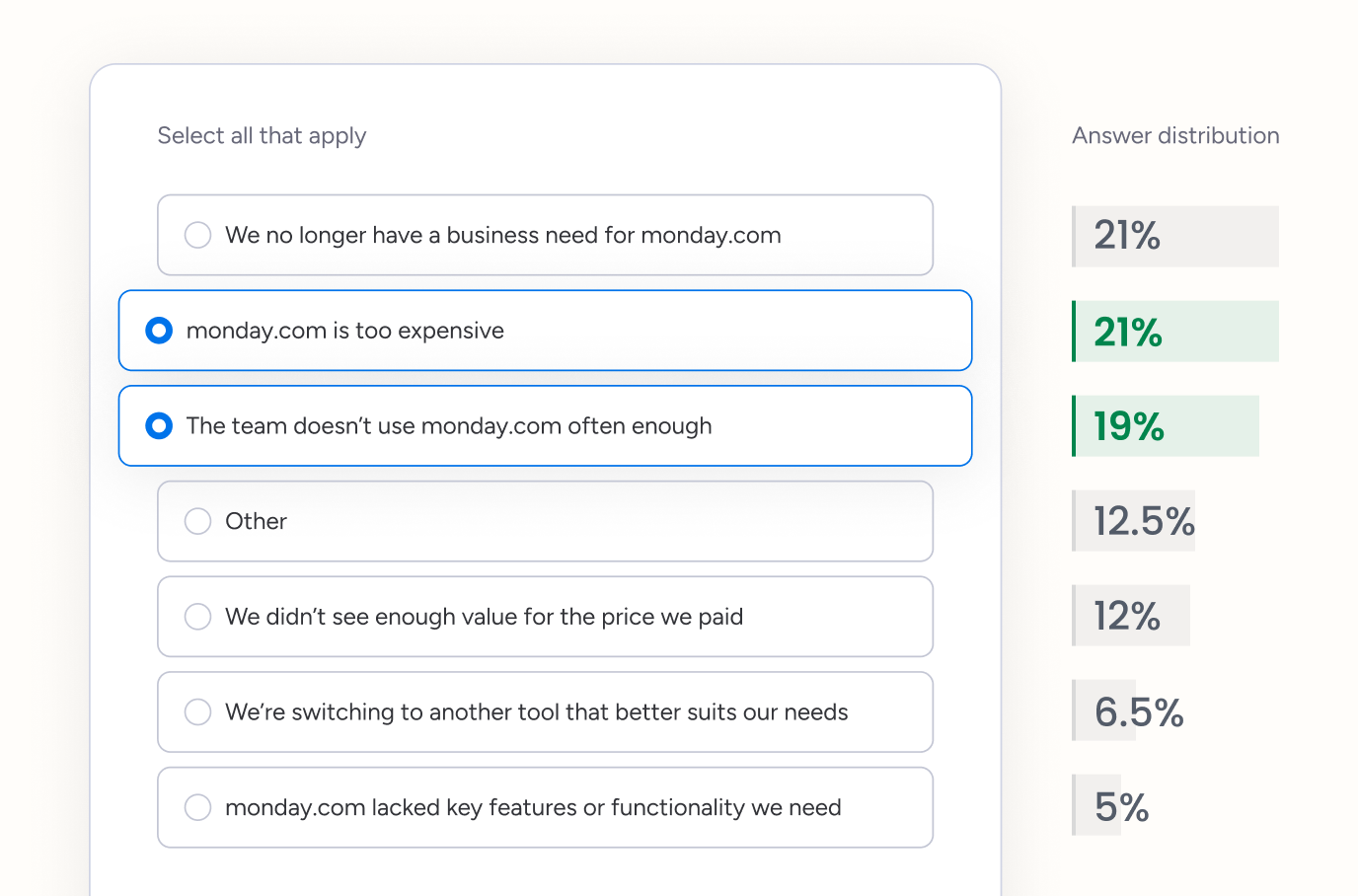
Optimising our exit survey surfaced our biggest opportunities
A research survey with cancelled accounts indicated that our existing options were too specific, which was causing many users to select “Other” as a reason for cancelling.
Rebuilding our categories dropped “Other” from 20% to 12.45%, making the segmentation more accurate for downstream personalisation.
A research-driven price breakthrough
Nine interviews with cancelled customers found small teams locked into plans with seats they weren't using, with no flexibility from support to fix it. We sized the opportunity at roughly 40% of price-related cancellations coming down to this mismatch.
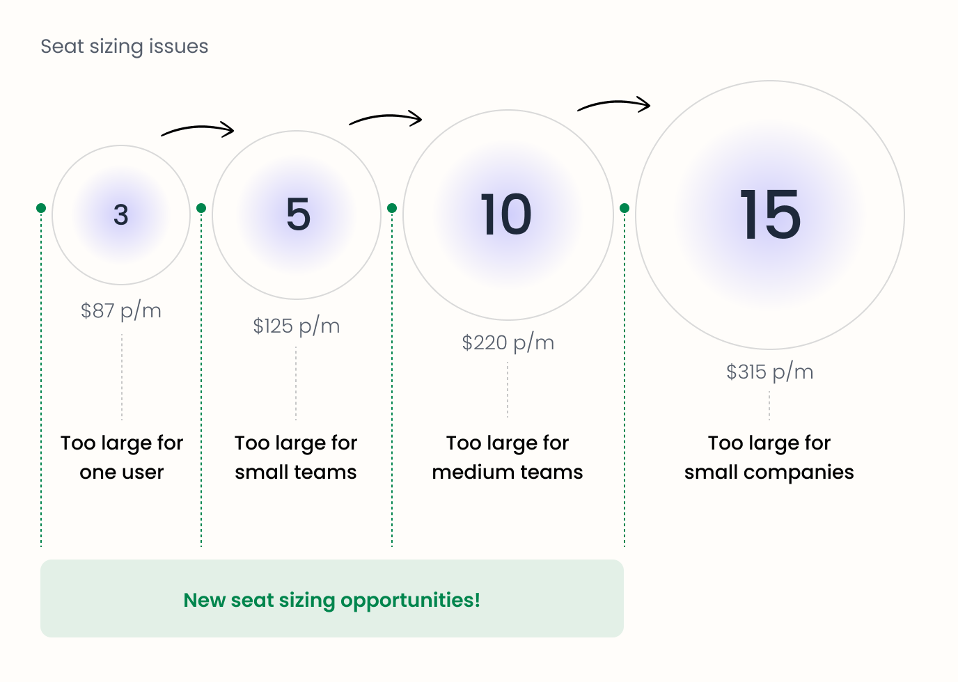
“We had five or six users but were paying for 10... as a small business it just got a bit out of hand.”
“We tried reaching out to sales about the pricing, but there wasn't a good solution.”
Design foundations
Empowering the team by using our collective brainpower to ideate, inspire, align and set ownership. Developing principles to guide design for all churn reduction flows in the future.
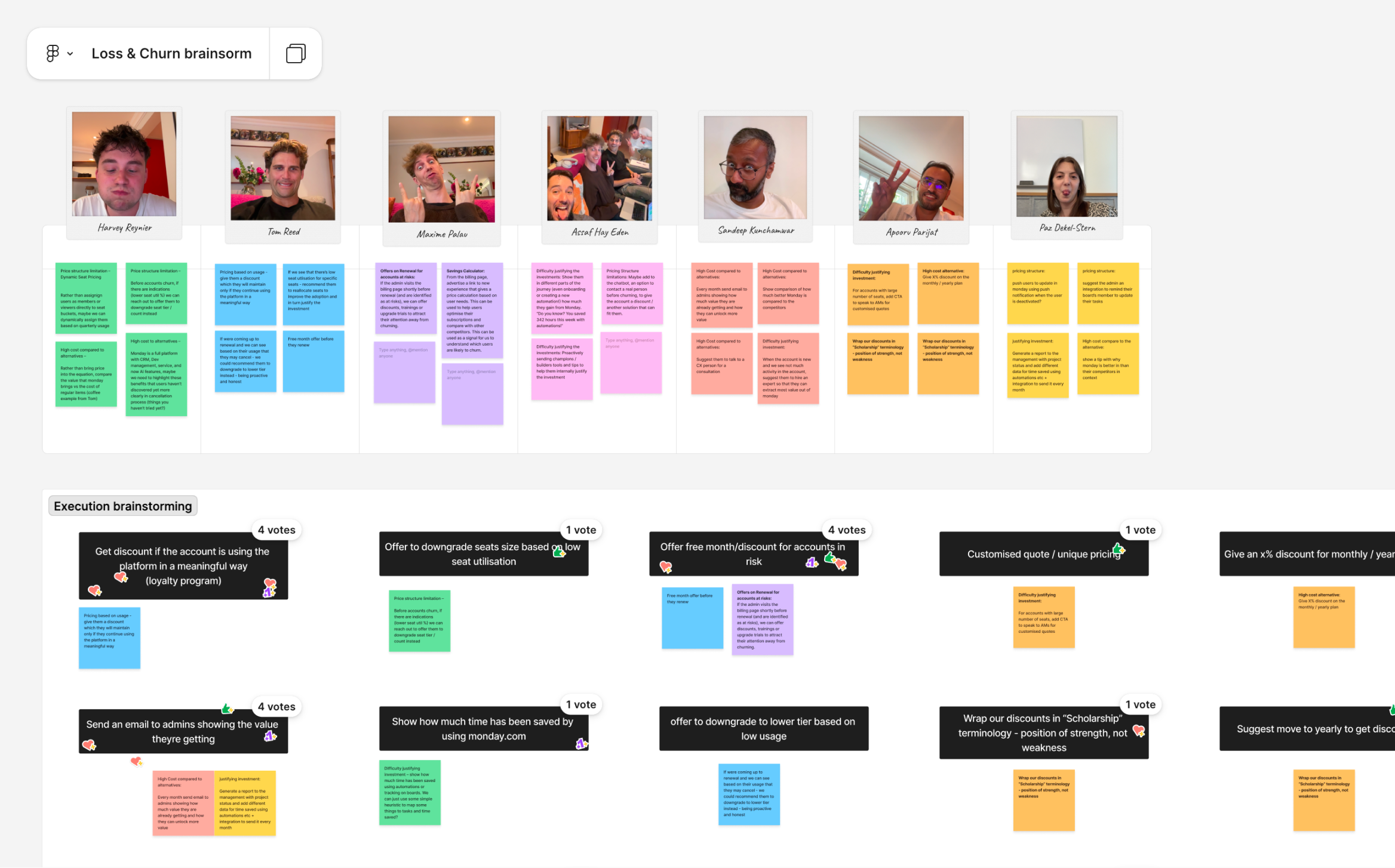
Three principles governed every test
We also created a set of Experience Principles to ensure our work remained focused and guide the creation of a value driven trustworthy cancellation experience.
1. Make it intentional
Every screen states plainly what a decision means, so admins choose with full information, not by accident.
2. Transparency over conversion
Every step shows exactly what's happening, never obscured to protect a conversion number.
3. Friction, never frustration
Enough friction to make someone pause and reconsider, never enough to lose the relationship on the way out.
The quality bar every test had to clear before production
85%+ comprehension and 85%+ positive sentiment was required through validation testing with participants before we could move design into execution.
85%+
Comprehension
Participants needed to clearly understand the value proposition or offer.
85%+
Positive sentiment
Participants needed to view the solution as a device to give value to the user to help them stay, not push them to stay.
One flow, not five screens
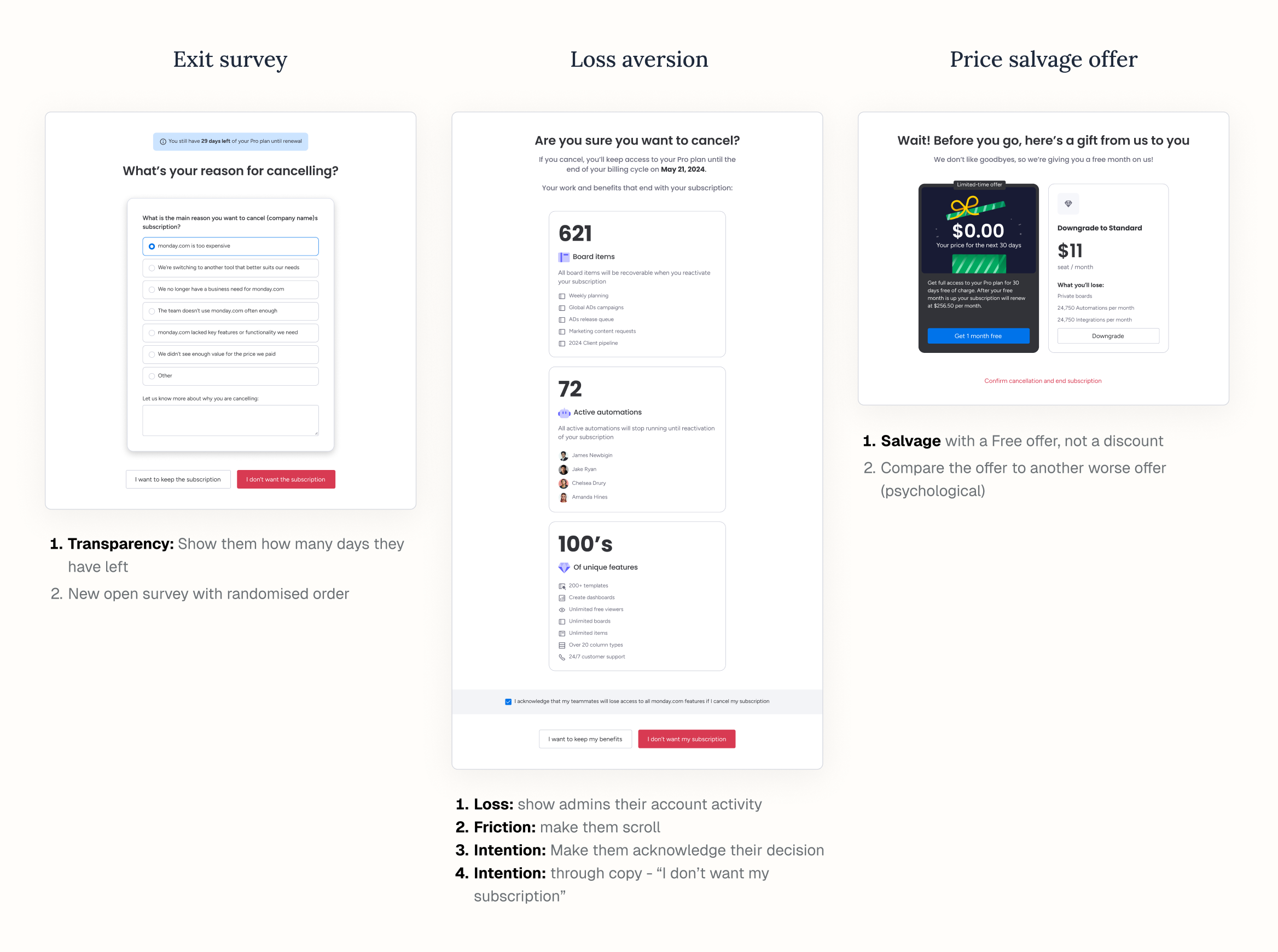
Before building anything, I sketched the whole experience end to end so every test shared the same design language. Variations of each were stress tested against our quality bar.
Design + Impact
“A gold standard in churn reduction”
This cancellation flow became the gold standard for how monday.com off-boards customers, influencing three teams, two of which successfully recovered ARR and improved retention from their cancellation and deactivation flows.
Loss aversion: making the decision feel intentional
Admins now see exactly what their team stands to lose (active boards, automations, integrations) and have to tick a box acknowledging it before continuing. Making the loss concrete instead of abstract gave them a real pause before confirming.
$4.2M
ARR saved
Salvage offer: a month free instead of a discount
- Discount: no measurable lift. It asked people to calculate future savings instead of solving today's problem.
- One month free: It gave immediate, tangible relief, which performed well, but not as well as we predicted - it proved to be a “blanket offer”. Personalisation through our seat tier offer provided the lift we predicted.
$846K
ARR saved
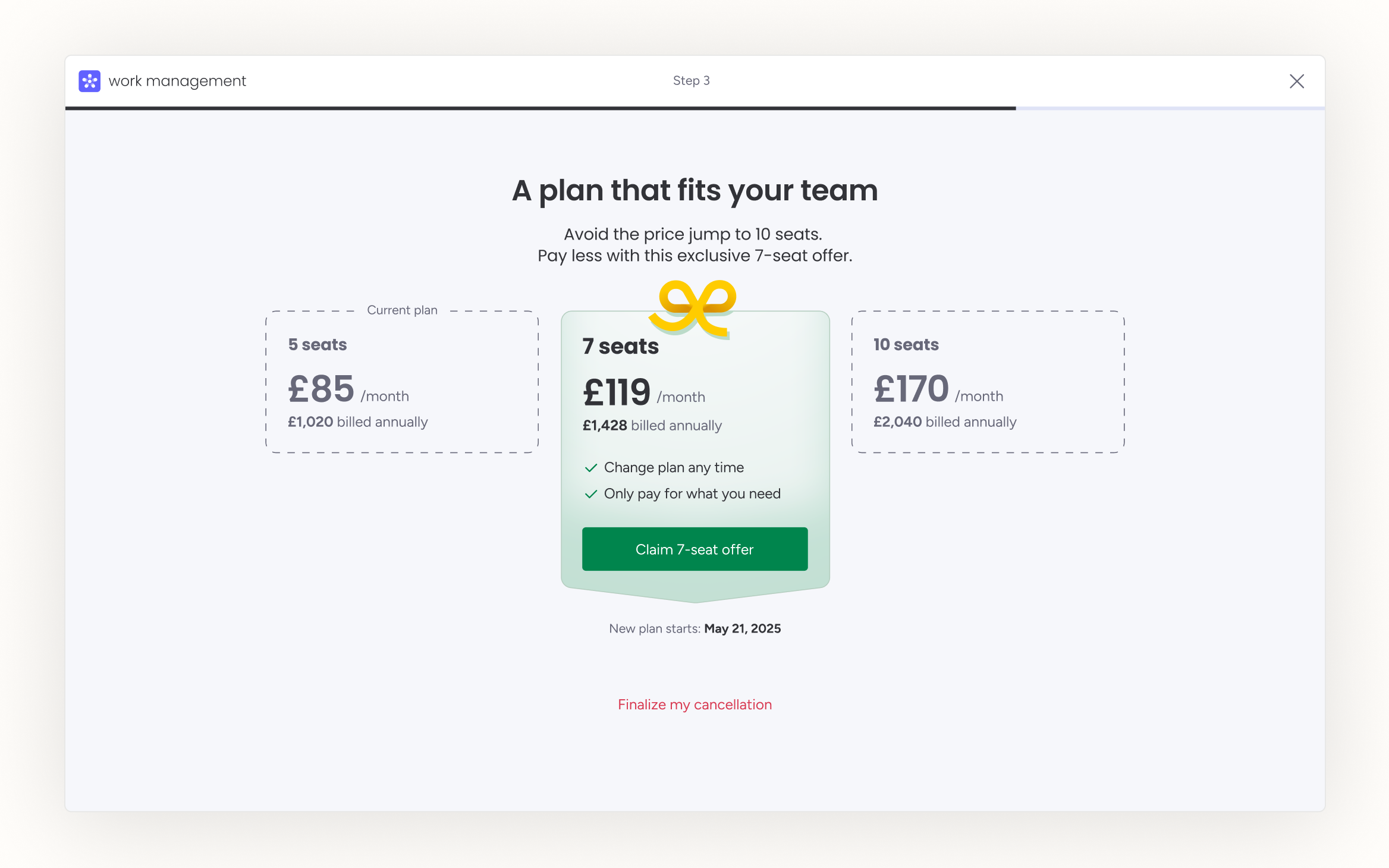
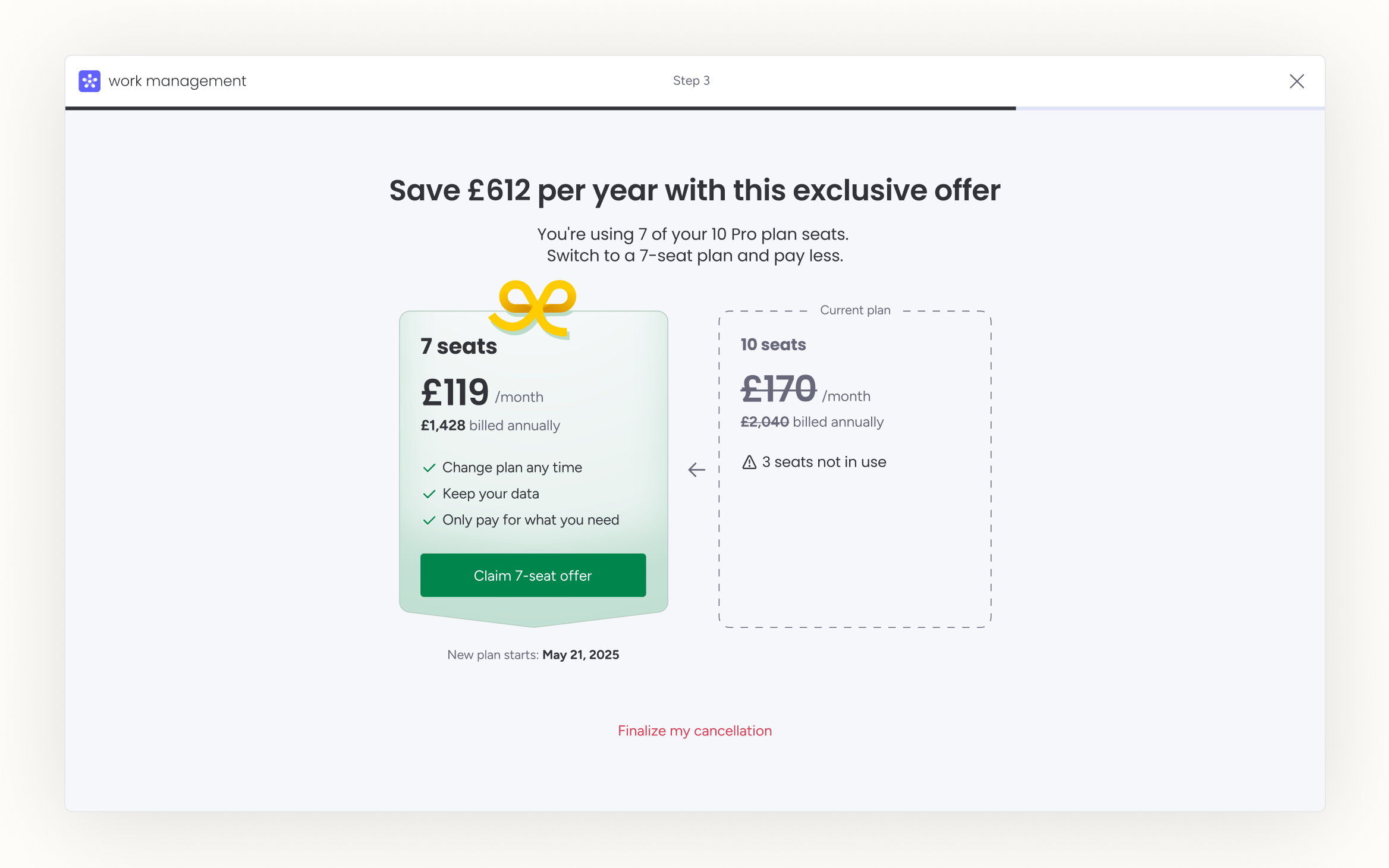
Salvage offer: right-sized seat tiers
New 2, 7, and 12-seat tiers (built after we made the business case to the billing team) fixed the seat sizing problem and produced the biggest salvage win of the three tests.
$1.1M
ARR saved
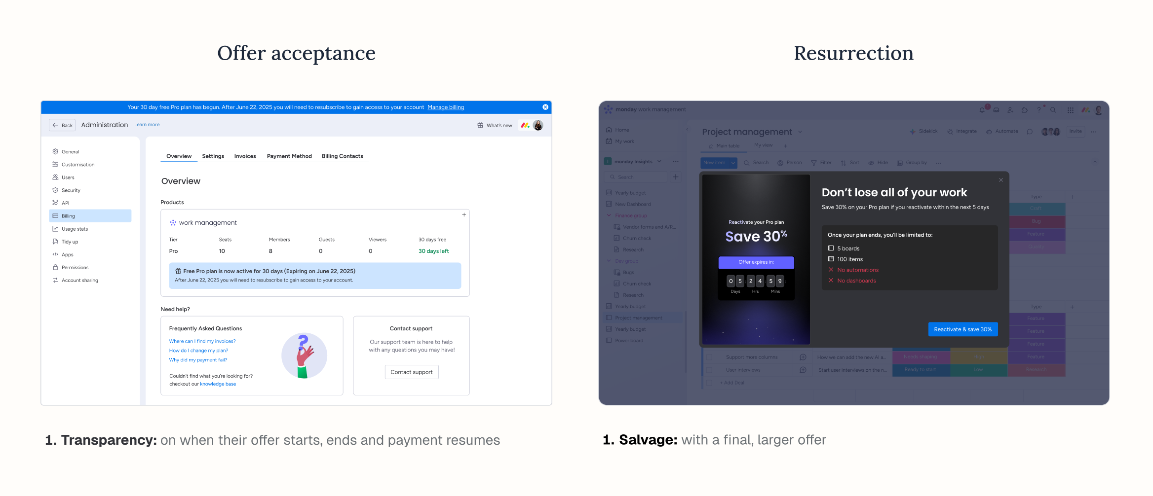
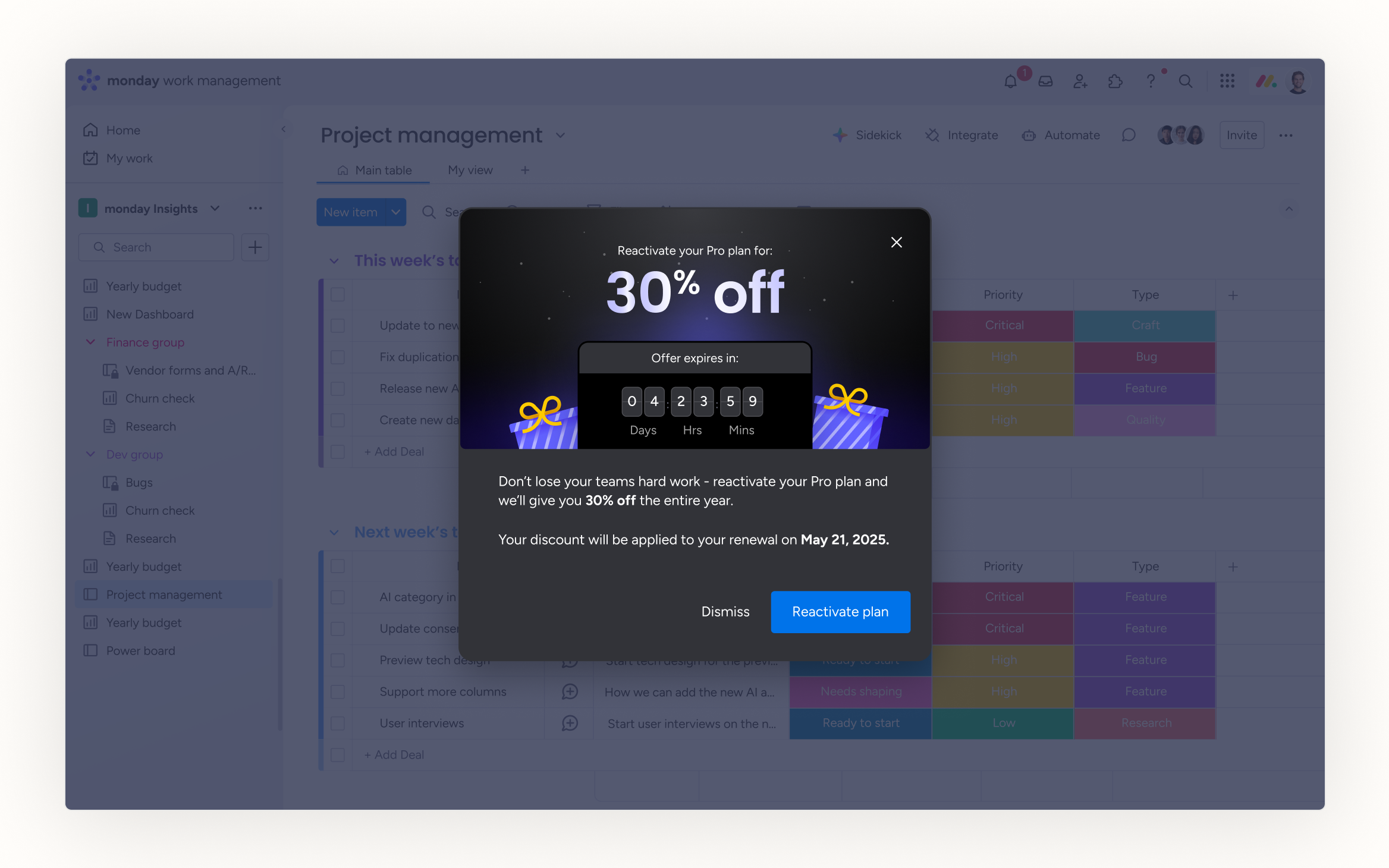
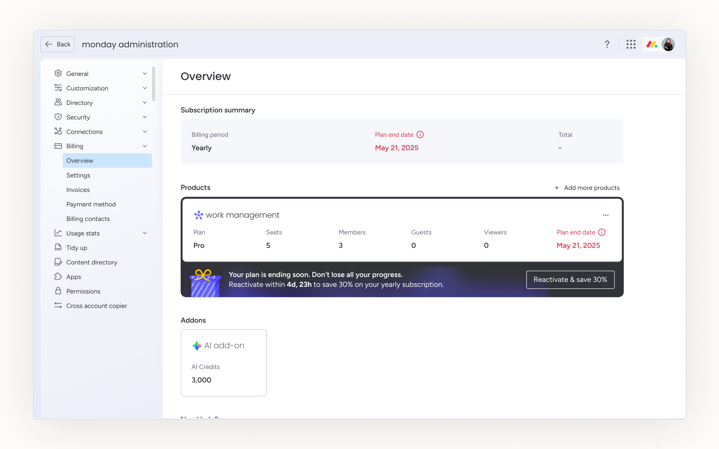
Resurrection: winning back the almost-gone
A personalised, time-limited win-back offer reached every admin who logged back in, not just the admin who saw it in the cancellation flow, giving the offer far more exposure.
$700K
ARR saved
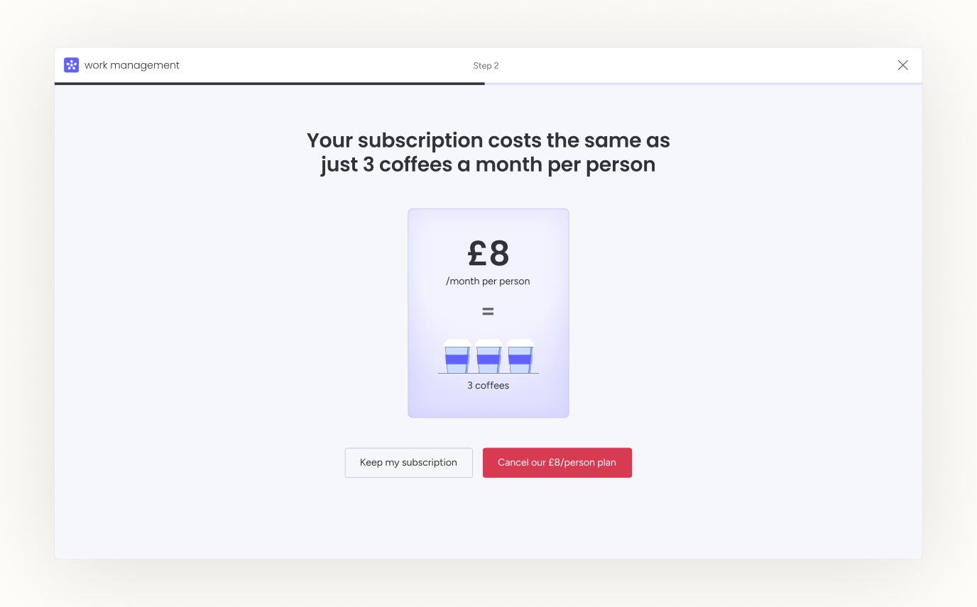
The test we chose not to ship
$500K saved, and redacted anyway.
A price-to-coffee comparison for price-sensitive accounts worked, but it tipped past “considered” into “annoying” and broke our second principle. We chose the principle over the number.
Impact
$6.8M ARR
Recovered directly, through the new cancellation flow
13% loss reduction
From 3.9% to 3.38%, outperforming the 3.5% industry standard
$1.6M ARR
Recovered indirectly, after a second team adopted the framework for marketplace-app churn
+45%
At-risk members rescued, after a third team applied it to the member deactivation flow
Reflection
Personalisation is the gap I didn't close
Personalisation was one of the three gaps we set out to close, and we only fully solved it for pricing-driven cancellations. I moved teams before taking it further. If I had stayed, the next thing to solve would have been building a scalable system for personalised loss aversion and salvage offers across our other biggest churn segments, starting with low team adoption.