Roam Digital · 2022
A Daily Health Companion for Edison Members
Overview
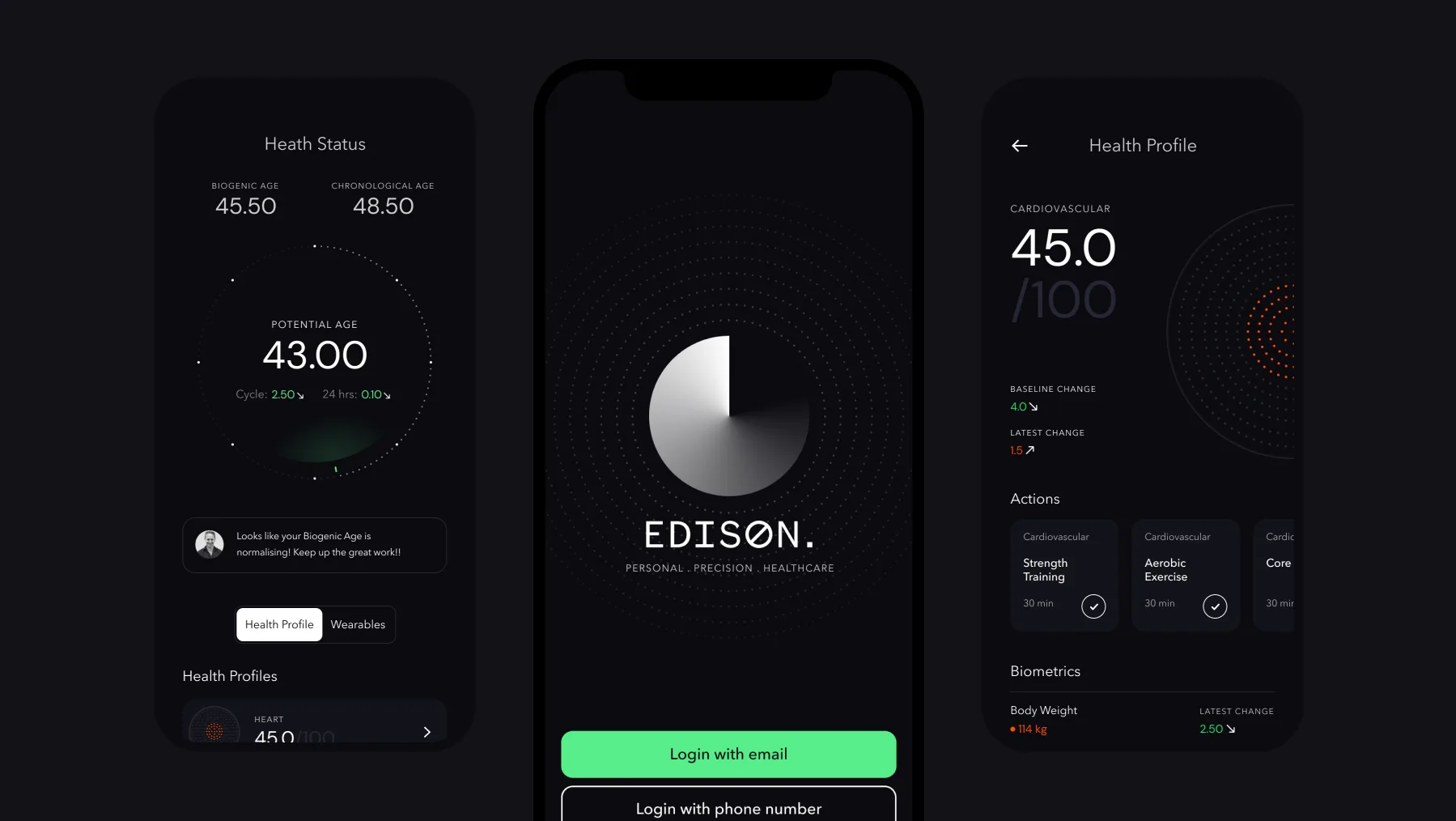
As product design lead I ran discovery through delivery for Edison's digital products, replacing PDF health protocols with a companion app that lifted plan adherence 35% and left two staff able to manage every member account.
Role
Product Designer
Timeframe
4 months
Team
1 Product Manager
2 Engineers
Responsibilities
User research
Workshop facilitation
UX flows
Visual identity
Usability planning and testing
Impact
+35%
Increase in plan adherence, the number the whole project was aimed at
2
Employees now manage every member account between them
Challenge
Edison's members were operating blind on their own health data
Edison is New Zealand's leading preventative healthcare specialist, using technology and biological data to provide hyper-personalised healthcare for people trying to reach their full potential. Its consultation, delivery and maintenance process is complex and has many touchpoints.
Internal research found that most customers struggled to stick to their personalised plans, for two reasons: too little contact with their assigned healthcare professional, and plans that arrived as PDF documents.
These are high net worth, health conscious clients. Their goals and health insights weren't accessible or easy to digest, which made it hard to track progress or picture where they were heading.

Approach
Mapping both journeys before proposing anything
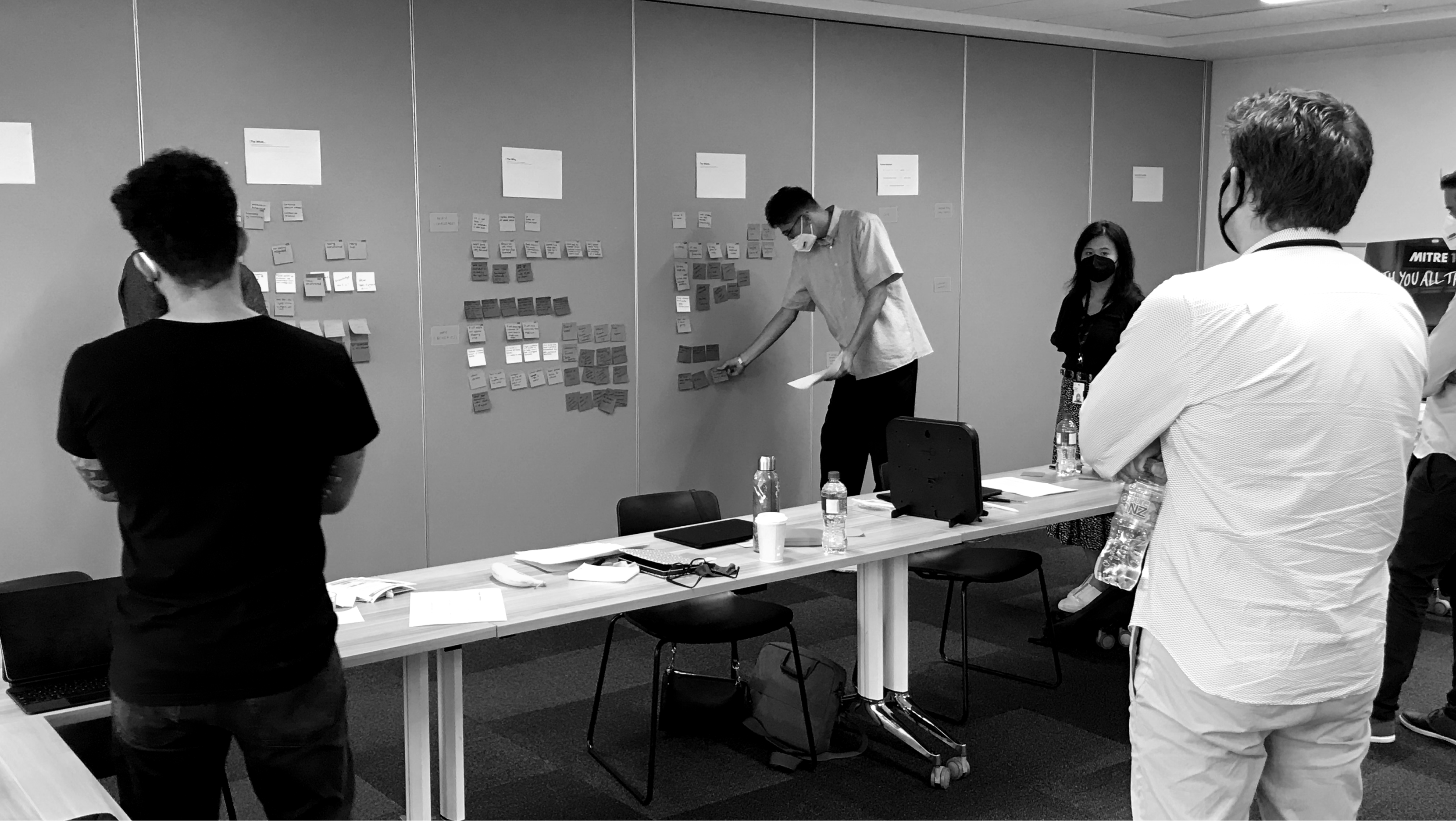
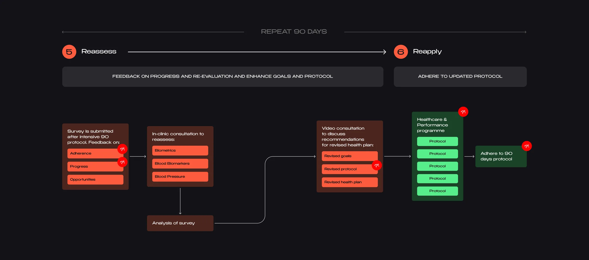
I facilitated an expert download and problem-statement workshop (who, what, where, why), then mapped the existing acquisition and retention journeys end to end. Splitting them mattered: the two failed in different places and for different reasons.
Acquisition: excitement peaked, then stalled
Members felt well informed and cared for right up until their comprehensive health results arrived.
They had paid for the assessment and then received nothing actionable until their first protocol landed. Initial excitement faded in the gap, and motivation went with it.
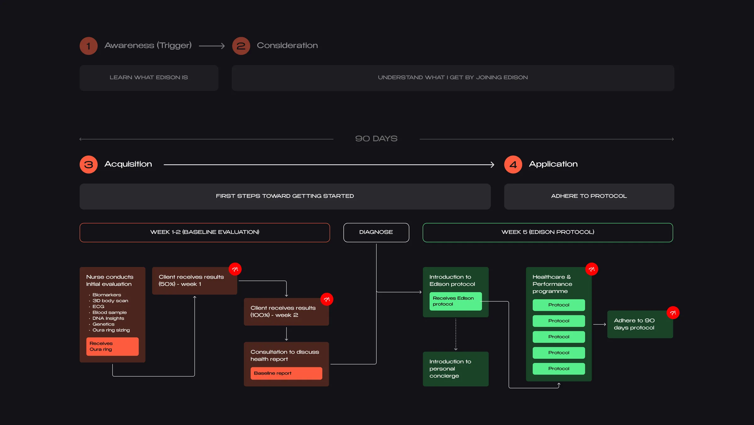
Retention: the protocol was clear but adherence lagged
- Too much to digest. The PDFs were dense, with no way to track adherence or progress.
- No support. Members had no direct line to a clinician when they got stuck.
- No flexibility. Plans didn't adapt to busy lives and felt cookie cutter, so people got bored or drifted away.
- No visibility. Nothing tracked adherence, so low adherence was only assumed, and members' self-reports couldn't be trusted.
I feel bad when the personal trainer gives me a plan which I can't finish, I get frustrated as I know it's not relevant for me.
Four how-might-we bets came out of it
The journeys gave us four directions worth designing against, each aimed at a specific point where members had been losing motivation.
Make the data mean something
Leverage data provided by clients to generate contextual and actionable insights.
Support around the clock
Ensure clients feel supported 24/7 through bite-sized coaching and timely communication.
Earn attention, then keep it
Attract new clients and retain current ones by providing a great experience and high levels of engagement.
Turn goals into habits
Guide clients towards setting and reaching meaningful goals through achievable milestones that create good habits.
Outcome
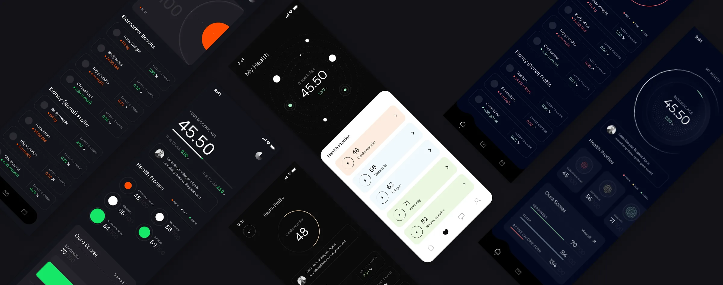
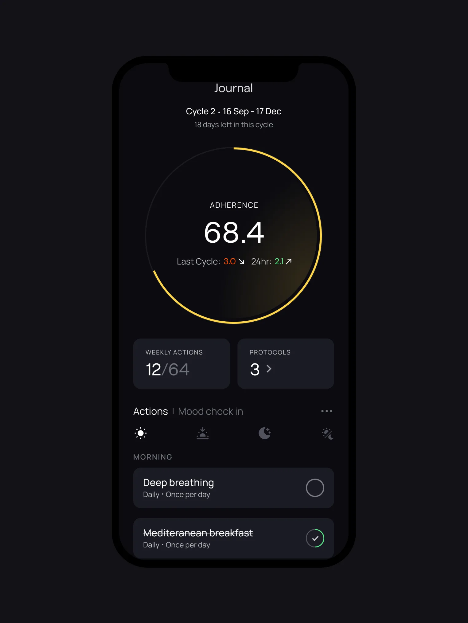
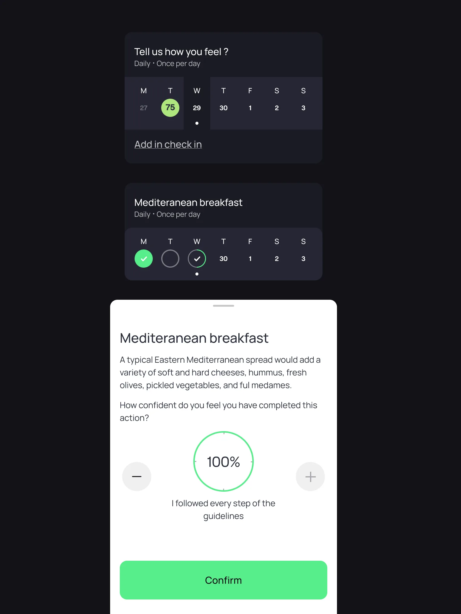
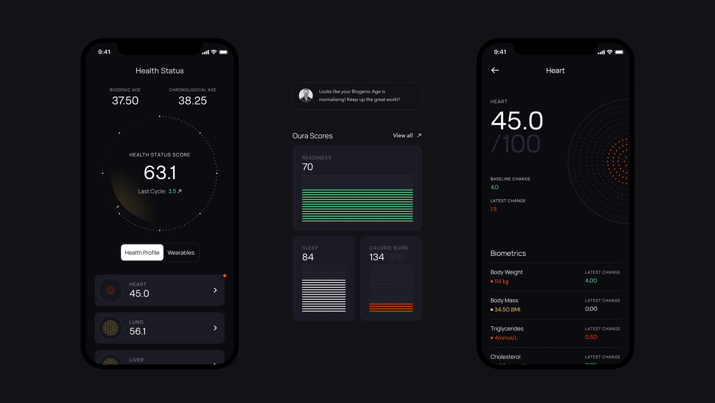
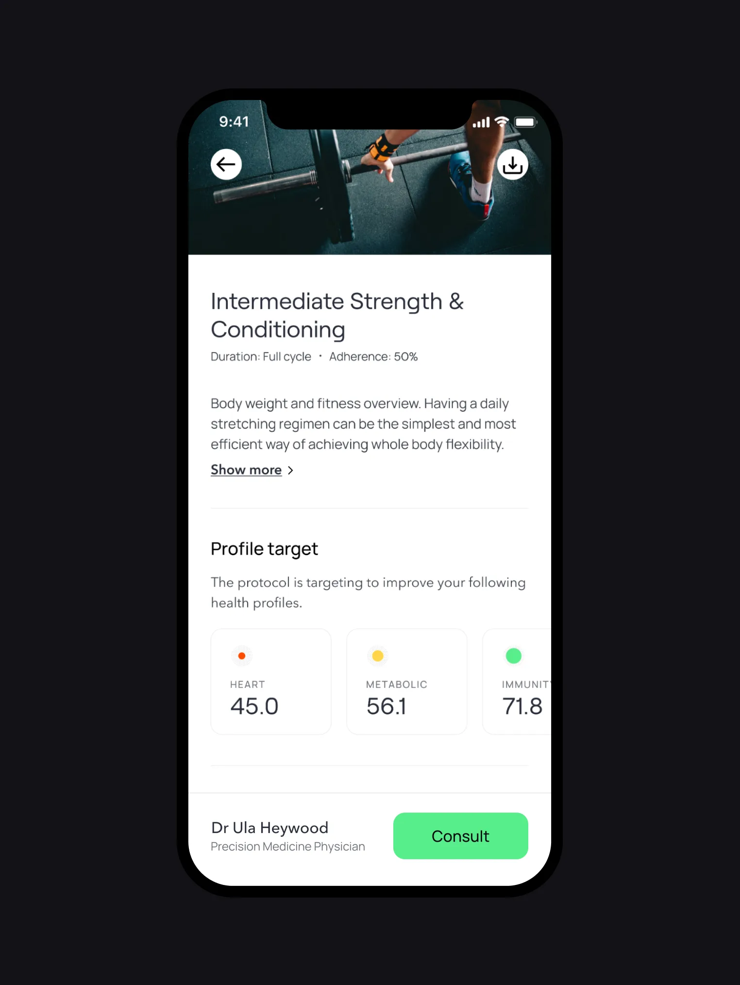
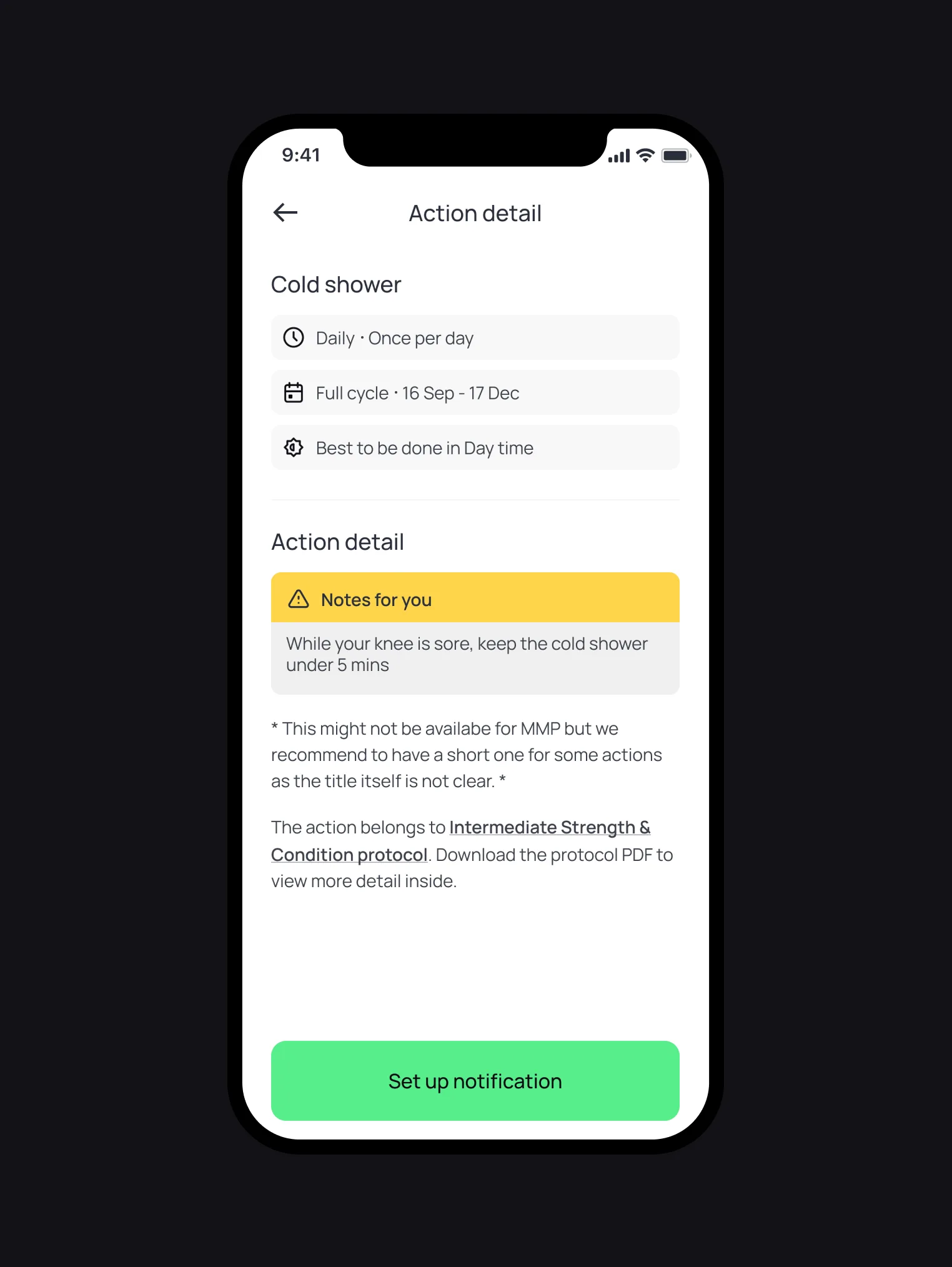
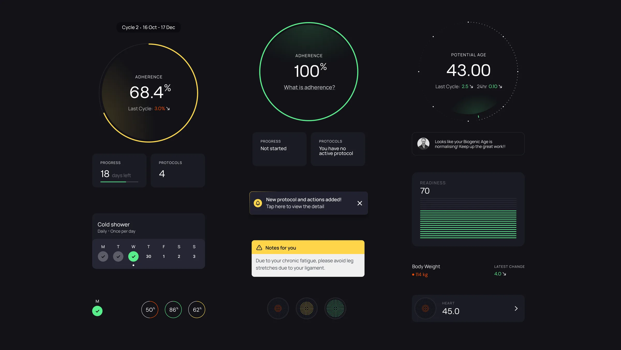
A digital companion app, everything under one Care Plan
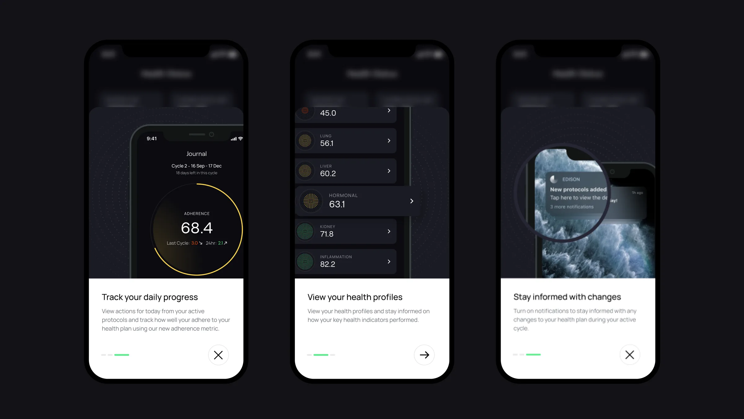
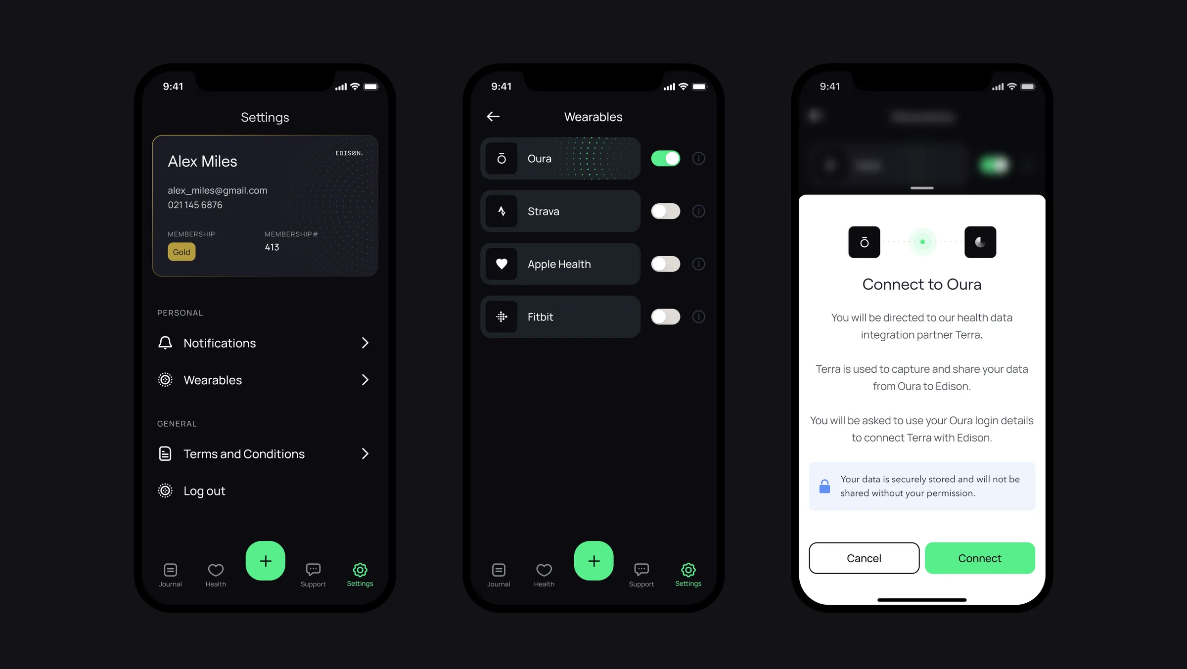
The app synthesises and displays contextual, timely and actionable insights for each Edison member under a single Care Plan, built around personalisation, clear communication and the quality of the experience itself.
The feature we cut, and why cutting it was right
In-app messaging with a member's concierge was in the plan from the start. We removed it.
In-app clinician chat looked like the obvious fix, since too little contact was one of the two main reasons adherence was failing. But members preferred the messaging apps they already used, and face to face for anything important. An in-app channel would have competed with those habits, and lost.
Impact
+35%
Increase in plan adherence, the number the whole project was aimed at
2
Employees now manage every member account between them
Reflection
Flexibility is the part the app could only half solve
The Care Plan made progress visible and adherence trackable, which is what moved the 35%. It didn't fix flexibility: members still disengaged when plans wouldn't bend around a busy life, and fixing that meant changing how Edison's clinicians write plans, not how members read them. That's an organisational change, not an interface one, and next time I'd make that case earlier instead of treating it as out of scope.